Brandon
Brandon was a Frontend Software Engineer who approached me for help with his portfolio UI design. He was passionate about web development and had a strong HTML, CSS, and JavaScript background. Brandon was keen to showcase his skills through his portfolio website and wanted to create a visually appealing design that would stand out to potential employers.
Task
Requested a clean and modern design that showcases his skills and projects. The design needed to be user-friendly and easy to navigate.
-
Strategy
UX Design
-
Design
UI Design, Prototyping
-
Client
Brandon
-
Tool
Figma
-
Platforms
Desktop, iOS
⬤ 01. Challenges
Design a clean and modern
portfolio UI that showcases Brandon's
coding projects and skills effectively.
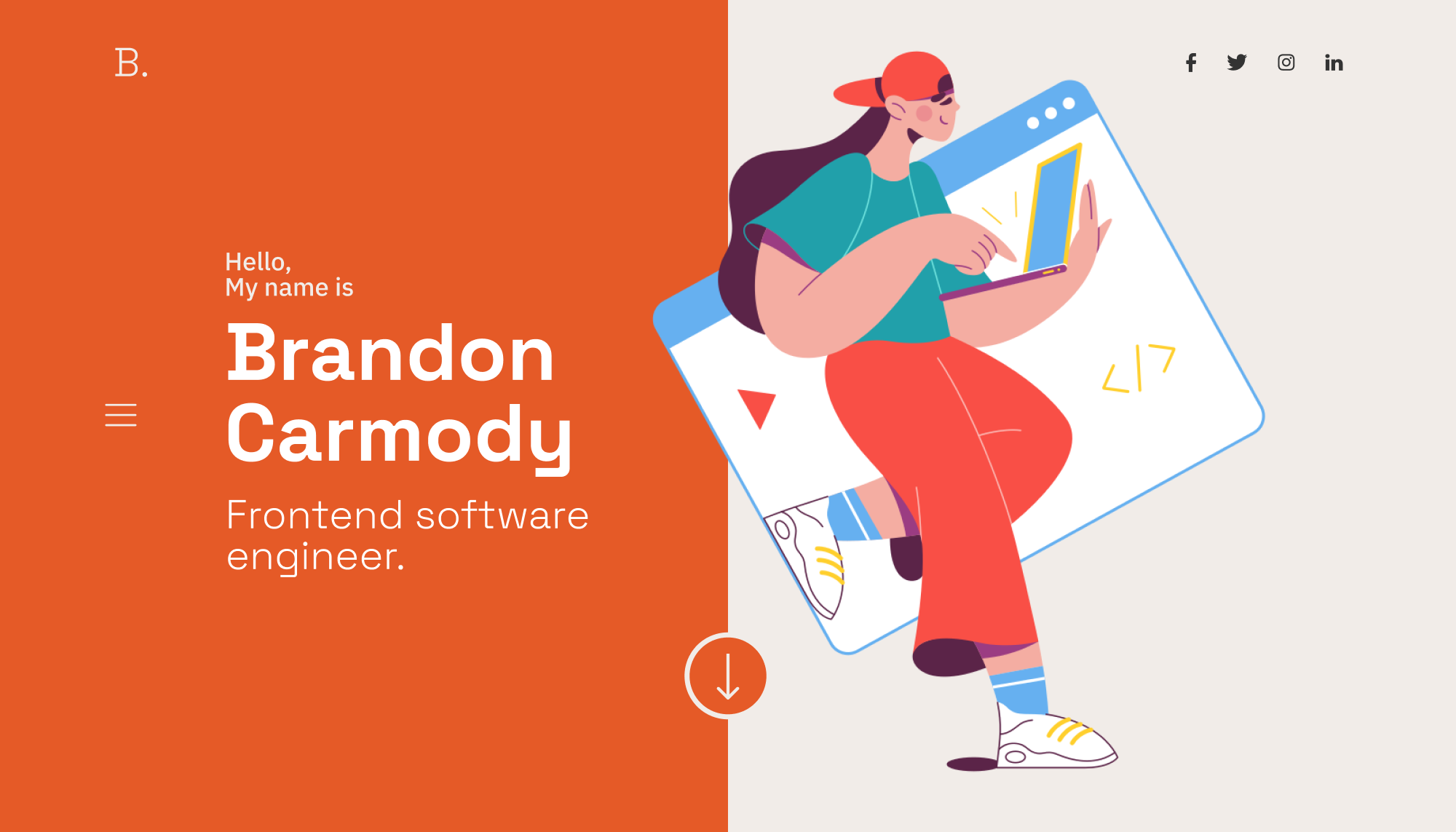
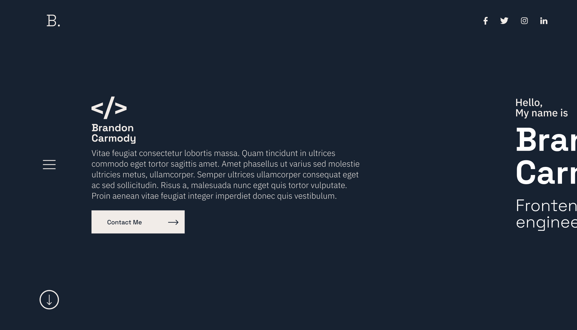
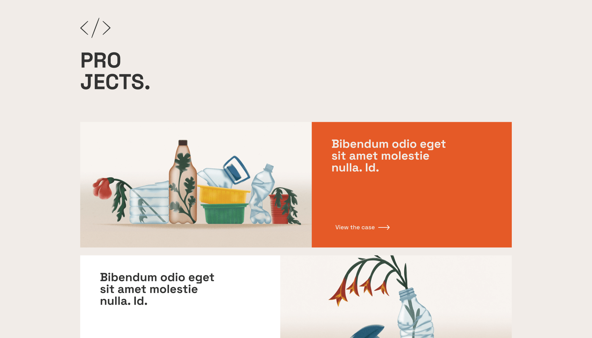
The UI should have a simple navigation bar, a homepage featuring a hero image and a brief bio, a portfolio section showcasing his best projects with hover-over effects, and a contact page with a contact form and social media links. The design should be responsive, easily navigable, and visually appealing.
The design should highlight Brandon’s skills, showcase his work and encourage potential clients to contact him.
⬤ 02. Experience
Crafting a seamless user experience showcasing
Brandon's front-end brilliance.
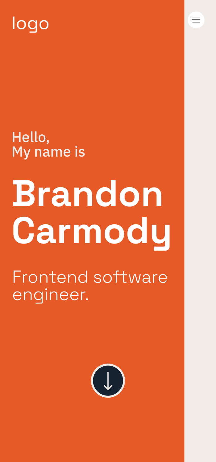
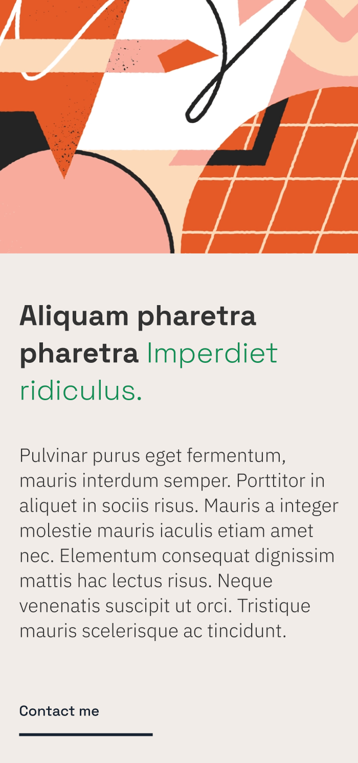
I created a clean, minimalistic portfolio UI design for Brandon that showcased his projects and skills in an easy-to-navigate format.
The design emphasized the use of visuals, intuitive navigation, and mobile responsiveness, ensuring a seamless user experience for potential employers or clients.


| Primary #E55A27 | ◯ | |
| R 229 G 90 B 39 |
Flame
| Background #F1ECE8 | ◯ | |
| R 241 G 236 B 232 |
Neutral Grey
| Black #333333 | SCSS var $color-black | ◯ |
| R 0 G 122 B 255 |
Dark Charcoal
| Alternative #172231 | ◯ | |
| R 23 G 34 B 49 |
Dark Gunmetal
I recommended a color solution for Brandon’s portfolio UI design that would create a visually pleasing and professional appearance.
The combination of these colors created a cohesive and modern look for Brandon’s portfolio that would capture the attention of potential employers and showcase his skills as a front-end software engineer.
Typography
/ Scales
Typeface
Space Grotesk
Usage
Headlines
Aà
I recommended Space Grotesk font for Brandon’s portfolio UI design because of its clean, modern, and legible design. It has a wide range of weights and supports multiple languages, making it a versatile choice for UI design.
AaBbCcDdEeFfGgHhIiJjKkLlMmNnOoPpQqRrSsTtUuVvWwXxYyZz 0123456789
Typeface
IBM Plex Sans
Usage
Paragraph
Lorem ipsum dolor sit amet, consectetur adipiscing elit. Praesent consequat velit sit amet velit consectetur, vel ullamcorper mi malesuada.
Typefase
Beatrice Regular
Usage
Headlines
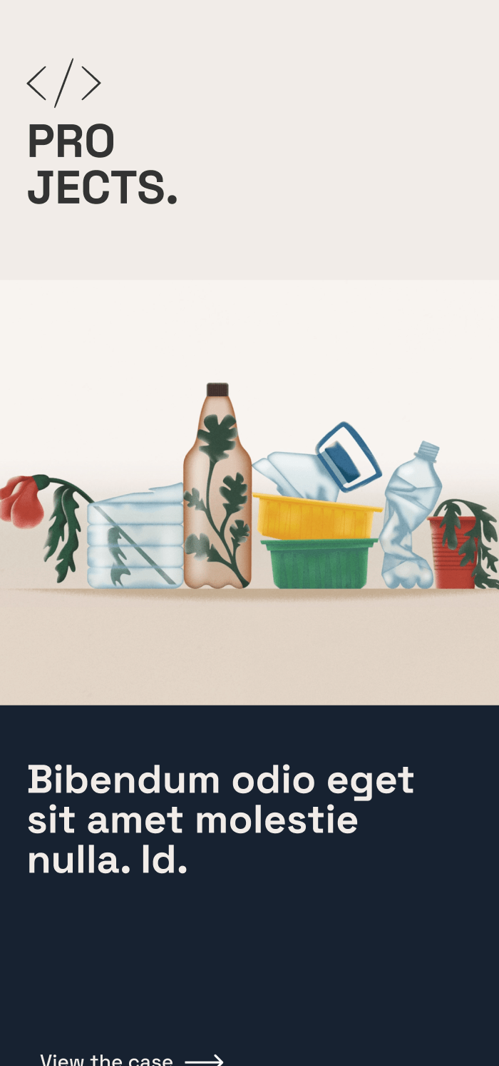
⬤ 03. Mobile Experience
Brandon's code came
to life beautifully.
Credits
Management
Stacey Grey
Brand Research
John Stamper
Project Manager
Colin Mondero
Account Manager
Art Direction
Stephen Miller
Creative Director
Sarah Rickson
Brand Strategy
Production
Melissa Macaya
Graphic Design
Mark Caldwell
UI/UX Desing
Awards
Site of the Day
Oct 20, 2020

Mobile Excellence
Sep 25, 2020

FWA of the Day
Sep 23, 2020
