Apollo
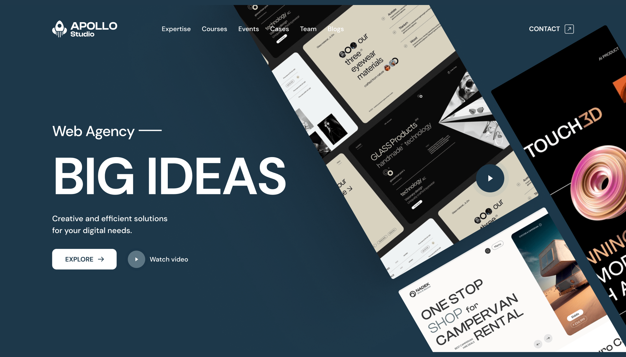
Apollo Studio is a dynamic and innovative web agency that has made a name for itself by delivering top-notch web design and development solutions, e-commerce solutions, digital marketing, and branding services. The agency has an impressive portfolio of clients from various industries, including e-commerce, technology, and healthcare. Additionally, the agency offers courses for students who want to learn the ins and outs of web design and development. Apollo Studio has reached out to get help designing intuitive and user-friendly interfaces that meet the needs of its clients.
Task
Create an engaging and user-friendly interface by designing visual elements, creating wireframes, and ensuring optimal user experience.
-
Strategy
UX Design
-
Design
Brand Design ,Wireframing, UI Design
-
Client
Apollo Studio
-
Tool
Figma, Illustrator
⬤ 01. Challenges
Crafting intuitive and captivating experiences for digital success.
Firstly, I must ensure the design is visually appealing, easy to navigate, and user-friendly. This would require extensive research into the target audience and their preferences.
Secondly, I need to ensure the website is responsive and works seamlessly across different devices and platforms.
Thirdly, I must incorporate the brand’s identity and message into the design while ensuring consistency with other marketing materials.
Finally, I would need to work closely with the development team to ensure the design is technically feasible and can be implemented efficiently.
My primary challenge is creating a website that meets the client’s expectations while also delivering a positive user experience.
⬤ 02. Experience
Crafting digital experiences that leave a lasting impression.
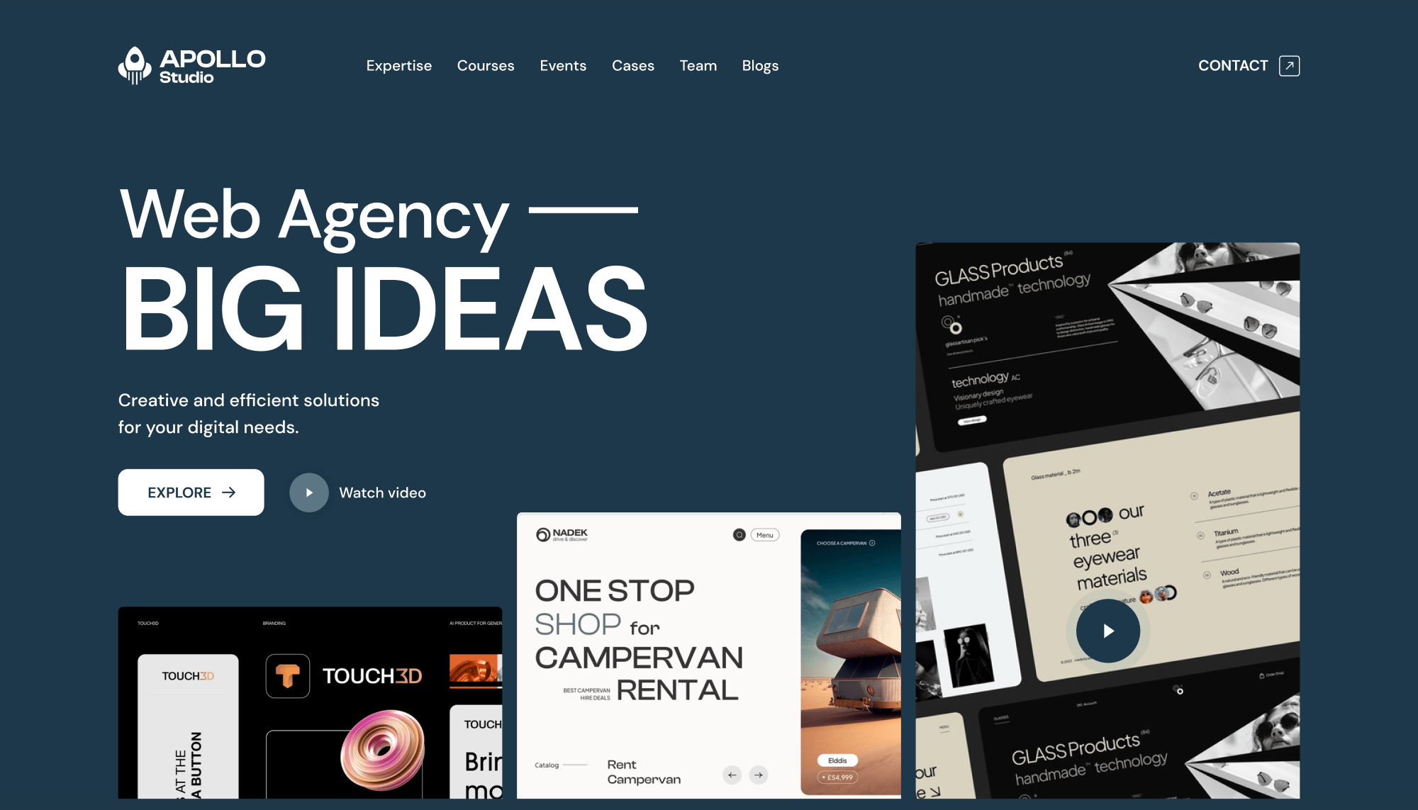
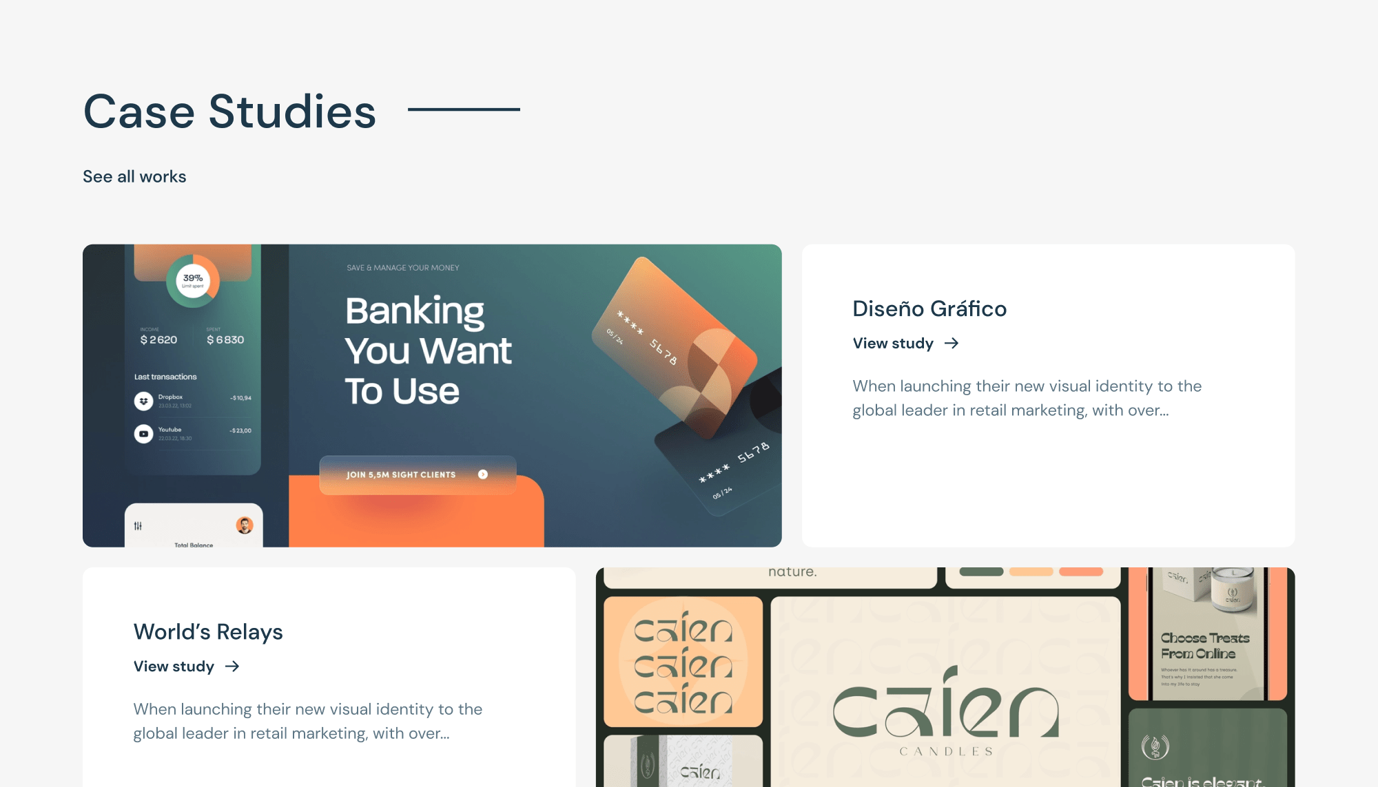
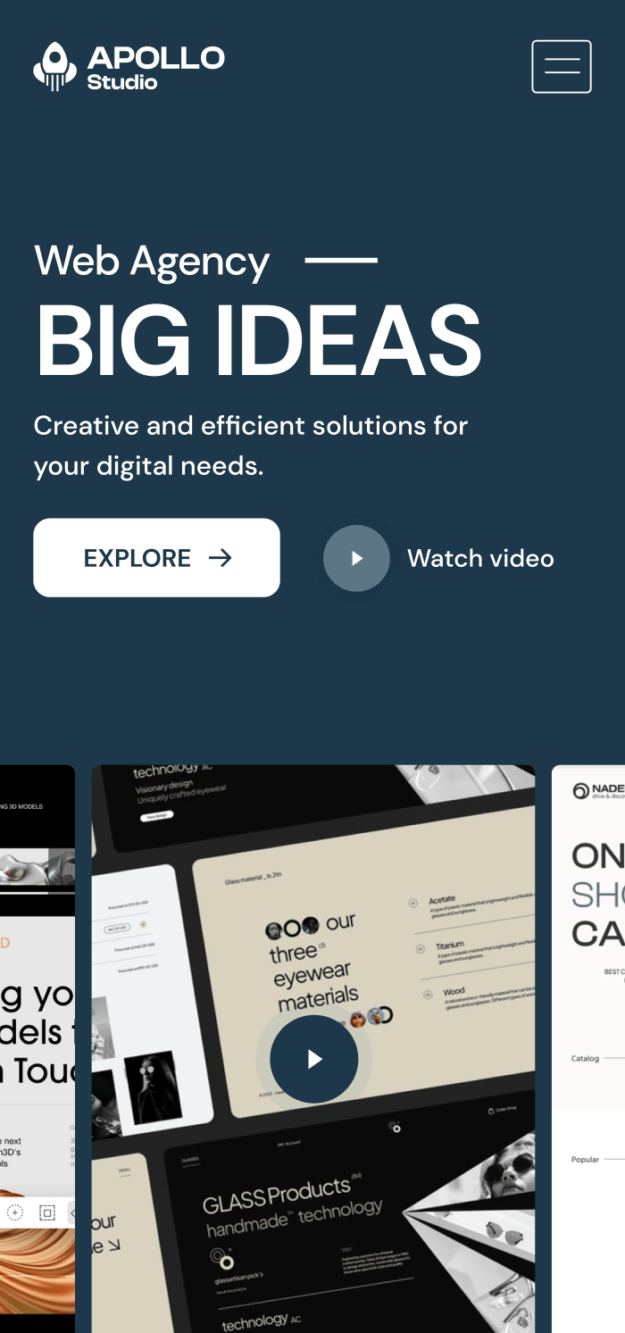
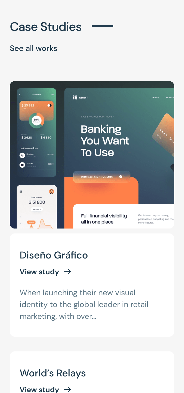
I created a clean and modern website design with a focus on user experience. The design incorporates a bold color palette, easy-to-use navigation, and clear calls-to-action to guide users through the website. The website also features responsive design, ensuring a seamless experience across all devices.
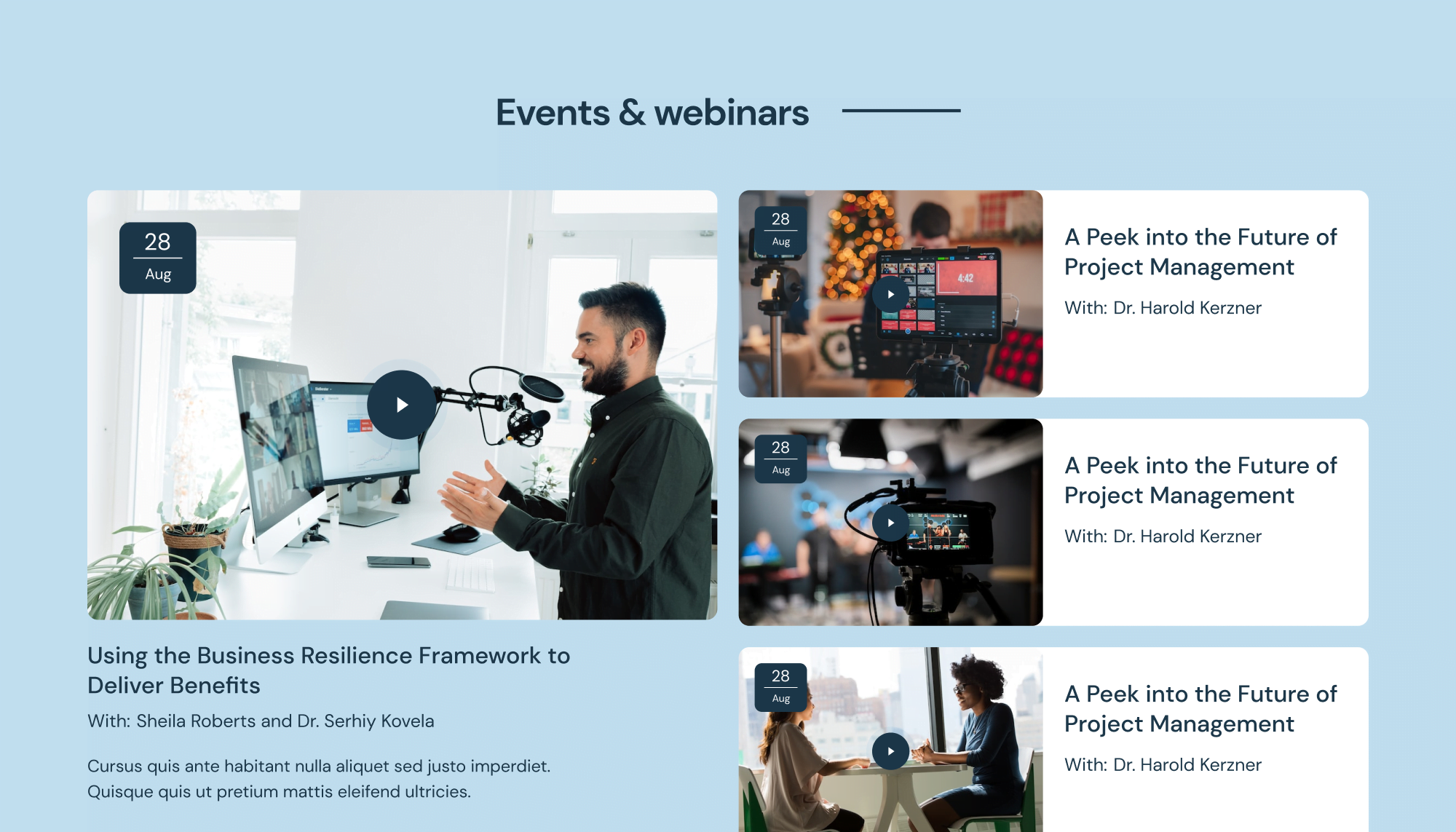
For the student course video, I included UX features such as a straightforward and easy-to-use navigation menu, an intuitive video player with playback controls, a progress bar to track course completion, and the ability to take notes or bookmark sections for later reference.

| Primary #1E384A | ◯ | |
| R 30 G 56 B 74 |
Blue Dianne
| Background #F6F6F6 | ◯ | |
| R 246 G 246 B 246 |
Wild Sand
| Paragraph #5D7685 | ◯ | |
| R 93 G 118 B 133 |
Greyish Turquoise
| Alternative #C1DFF0 | ◯ | |
| R 193 G 223 B 240 |
Tropical Blue
I recommend using a color palette that evokes professionalism, creativity, and trustworthiness. Blue Dianne represents trust, stability, and sophistication, essential for a creative agency.
Overall, this color scheme balances professionalism and creativity, providing a visually appealing and trustworthy website for Apollo Studio’s potential clients. It also aligns with their services, highlighting their web design and development expertise, e-commerce solutions, digital marketing, and branding.
Typography
/ Scales
Typeface
DM Sans
Usage
Headlines
Aà
DM Sans is a popular choice for UI because it’s legible, easy to read, and versatile. Its multiple weights and styles make it suitable for various design needs.
AaBbCcDdEeFfGgHhIiJjKkLlMmNnOoPpQqRrSsTtUuVvWwXxYyZz 0123456789
Typeface
DM Sans
Usage
Paragraph
Lorem ipsum dolor sit amet, consectetur adipiscing elit. Praesent consequat velit sit amet velit consectetur, vel ullamcorper mi malesuada.
Typefase
Beatrice Regular
Usage
Headlines
⬤ 03. Mobile Experience
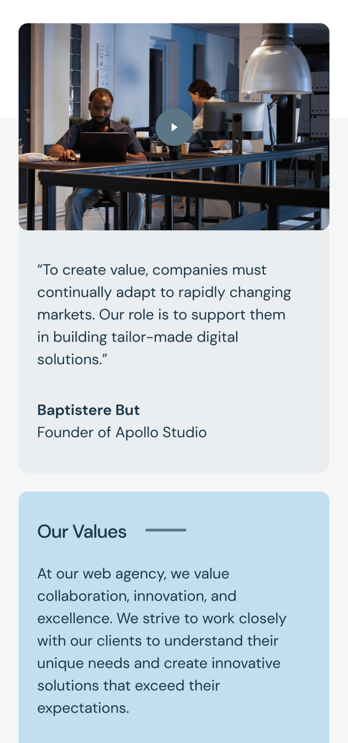
Experience digital magic,
seamlessly on the go.
Credits
Management
Stacey Grey
Brand Research
John Stamper
Project Manager
Colin Mondero
Account Manager
Art Direction
Stephen Miller
Creative Director
Sarah Rickson
Brand Strategy
Production
Melissa Macaya
Graphic Design
Mark Caldwell
UI/UX Desing
Awards
Site of the Day
Oct 20, 2020

Mobile Excellence
Sep 25, 2020

FWA of the Day
Sep 23, 2020
